NIWA
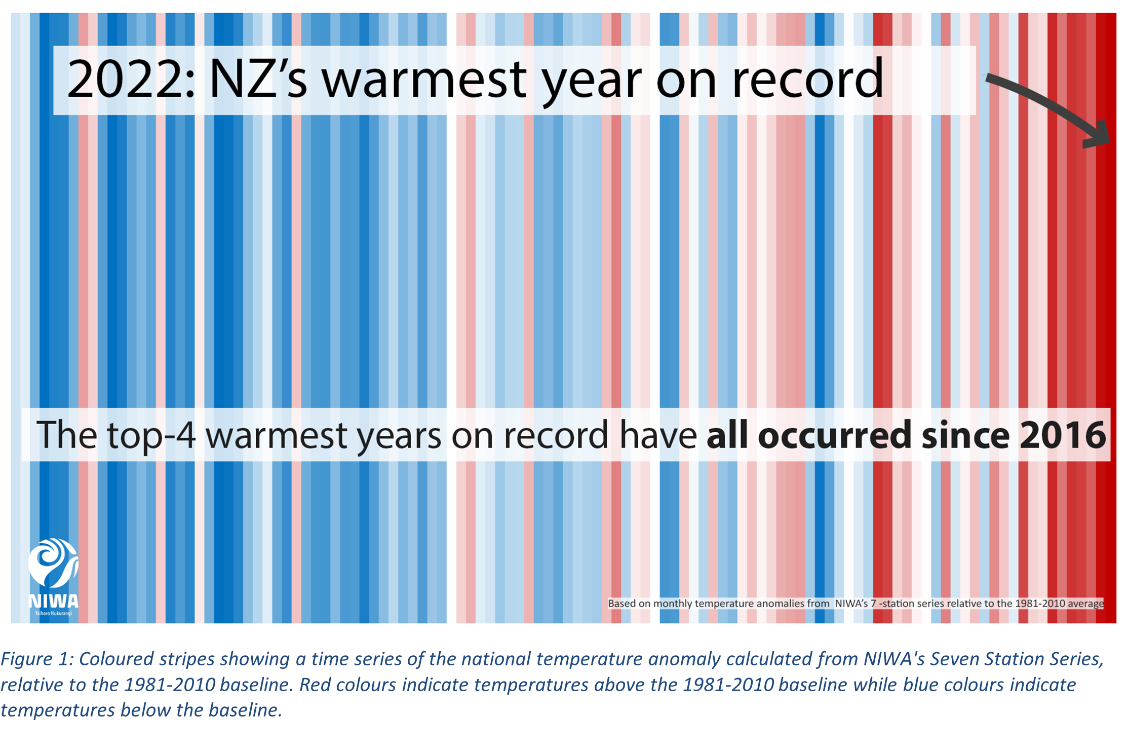
Figure 1: Coloured stripes showing a time series of the national temperature anomaly calculated from NIWA's Seven Station Series, relative to the 1981-2010 baseline. Red colours indicate temperatures above the 1981-2010 baseline while blue colours indicate temperatures below the baseline.