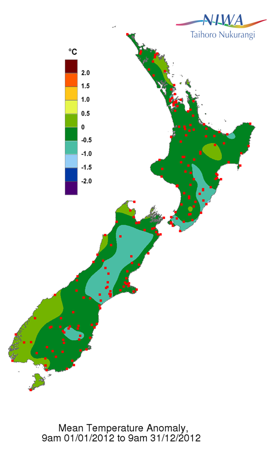
The 2012 mean temperature difference from normal (or “anomaly”) map, showing most of the country was slightly cooler than average for the year. The red dots are the locations of the climate stations at which temperature data were recorded and used to produce this map. These data are available from NIWA’s national climate database (http://cliflo.niwa.co.nz).