Changes in NZ air quality due to COVID-19 level 4 lockdown.
Air quality update 7 for Tuesday 28 April 2020. End of level 4 restrictions.
Headlines
- During the whole of level-4, concentrations of road traffic exhaust pollutants (nitrogen oxides) were down at near-road monitoring sites across Auckland by 54% at Queen Street, 66 % in Penrose, 73 % in Takapuna and 74 % in Henderson. Reductions were 66% at Willis Street (Wellington) and 76% in Riccarton (Christchurch).
- Across the whole of level-4, concentrations of airborne particulate matter (PM10) – which includes not just vehicle exhaust emissions and road dust, but other sources less likely to be reduced by the lockdown, such as sea spray and smoke from solid fuel home heating – were only marginally down across Auckland (9 – 28 % on average).
- Before this year there was a consistent downward trend in NOx levels related to the steady improvement in vehicle technologies. If this trend is resumed then the concentrations experienced during lockdown will not be repeated until the 2030s.
- The reductions in NOx are at the upper end of those reported around the world. The reductions in PM2.5 are similar to reductions seen in the world’s less polluted cities, but lower than reductions seen in more polluted cities, particularly in China and India.
Background
This is our fifth weekly update on air quality in New Zealand during the COVID-19 lockdown. The update is created by NIWA’s Principal Air Quality Scientist, Dr Ian Longley, and is based on unverified data provided by Auckland Council, Environment Canterbury and Greater Wellington Regional Council. “Unverified” means that the data has yet to go through the Council’s quality control process. This means a small error might be present. Verified data is usually available a few months after the original data was recorded. Lockdown conditions may introduce additional delays in verification of the data presented here.
Updates are not intended to provide comprehensive national coverage, but rather focus on emerging themes at indicative locations.
This review covers the whole of level-4 (26th March – 27th April).
Methods
1. What pollutants are used to judge urban air quality?
Urban air quality is most commonly assessed using three different measures of air quality, each with its own strengths and weaknesses:
- Oxides of nitrogen (or NOx) – the sum of nitric oxide (NO) and nitrogen dioxide (NO2) – this measure is the most representative of vehicle exhaust emissions, but can also be impacted by industrial and shipping emissions
- Nitrogen dioxide (NO2) – the more toxic of the oxides of nitrogen, for which national standards and guidelines are set
- Particulate Matter smaller than 10 or 2.5 microns (PM10 or PM2.5) – the sum of all particles in the air both man-made and natural, including smoke from home heating, dust and sea salt. Health risk assessments are most frequently based on these measures.
2. When do we compare lockdown air quality with?
Assessing changes in air quality is not as simple as it might seem. Variation in the weather can introduce considerable variation in air quality which any comparison should ideally compensate for. In general, one needs to compare air quality during lockdown with air quality in some comparable period. Five methods of increasing sophistication are:
- Air quality before the lockdown
- Air quality for this period last year
- Air quality for this period averaged over the last few years
- Air quality for this period assuming it follows the annual trend over the last few years
- Air quality as it would have been during lockdown had emissions not changed.
Different methods have been used by different researchers and organisations to calculate reductions in air pollution. Method 1 is likely to understate improvements as air quality is normally better in summer than in autumn. Method 3 is preferable to method 2 if historic data is available. Method 4 is better still so long as there is an evident trend and one has confidence that the trend would have continued into this year. Method 5 is the most sophisticated but requires a credible model that can reliably simulate air quality on an hour-by-hour basis.
Given that this is a quick analysis on data that has only just been collected, and that annual trends are not consistent across sites, in this case we have taken adopted method 3 – i.e. calculated the average concentrations over the period 26th March – 27th April inclusive in 2020 and compared the result to the average concentration over the same days over the period 2015 – 2019. This method may over-estimate reductions by up to 10 % by not accounting for long-term trends in improving air quality.
What are our findings?
1. Nitrogen oxides, including nitrogen dioxide
Nitrogen oxides (NOx) consists of two pollutant gases: nitric oxide (NO) and nitrogen dioxide (NO2). Levels of NOx in the air most closely represent the impact of emissions from vehicle tailpipes, especially diesels, although industry and shipping emissions may also contribute, whereas high levels of NO2 are associated with increased risk of stunted lung development in children, and a wide range of poor health outcomes.
Table 1 shows the average reduction in nitrogen oxides (NOx) across the whole of the level-4 lockdown. Reductions are 73 - 74 % at representative roadside sites. Smaller reductions of 66 % are seen at Willis Street in central Wellington and the partially industrial site at Penrose, and 54 % at Queen Street in downtown Auckland.
Table 1 also shows the average reduction in nitrogen dioxide (NO2) across the whole of the level-4 lockdown. Reductions range from 37 % to 65 %.
Table 1: Changes in average NOx and NO2 concentrations compared to the norm for this time of year (based on 2015-2019).
|
Average reduction in NOx |
Average reduction in NO2 | |
|
Queen Street, AKL |
-54 % |
-37 % |
|
Henderson, AKL |
-74 % |
-61 % |
|
Takapuna, AKL |
-73 % |
-58 % |
|
Penrose, AKL |
-66 % |
-46 % |
|
Willis Str, WTN |
-66 % |
-65 % |
|
Riccarton Rd, CHC |
-76 % |
-46 % |
Levels of NOx averaged over a week or more can naturally vary by +/- 40 % due to variations in the weather. A consistent reduction of more than this for a whole month means that the reduction can confidently be attributed to reduction in emissions rather than meteorological variation.
The reductions in NOx levels are broadly consistent with the drops in traffic in Auckland and Christchurch reported by the NZ Transport Agency of 73 % in Auckland and 68 % in Christchurch.
The smaller reduction for NO2 compared to NOx is to be expected and is related to the chemical properties of the oxides of nitrogen and the way NOx is split into NO and NO2.
2. Particulate matter (traffic, heating, industrial and natural sources) in Auckland
Table 2 shows the average reduction in particulate matter across the whole of the level-4 lockdown. Compared to NOx, reductions are smaller and less consistent. Results are given for PM10 (particles smaller than 10 microns), and for PM2.5 (particles smaller than 2.5 microns). Currently, air quality in New Zealand is judged against a National Environmental Standard expressed in terms of PM10. However, internationally PM2.5 is more common.
Table 2: Changes in week-average PM10 and PM2.5 concentrations compared to the norm for this time of year (based on 2015-2019).
|
Average reduction in PM10 |
Average reduction in PM2.5 | |
|
Queen Street, AKL |
-14 % |
-10 % |
|
Henderson, AKL |
-9 % |
Not available [PM2.5 is not monitored at Henderson] |
|
Takapuna, AKL |
-28 % |
Not available [Data before 2020 is not used due to concerns over data quality] |
|
Penrose, AKL |
-15 % |
Not available [Data from 2020 is not used due to concerns over data quality] |
|
Patumahoe, AKL |
+7 % |
+8 % |
|
St Albans, CHC |
-9 % |
-2 % |
Levels of PM averaged over a week or more can naturally vary by 10-15 % due to variations in the weather. That reductions in PM have been recorded at every urban station in this analysis suggests that changes in PM are more likely due to falls in emissions, however the small magnitude means that an explanation based on natural variations in the weather cannot be ruled out. The rise in PM at the rural station of Patumahoe (which cannot be due to increased traffic emissions) also supports the conclusion that reductions in traffic have reduced urban PM levels.
The smaller reductions in PM, compared to NOx, are due to the fact that many emissions sources other than traffic emit particles and contribute to PM10 levels in the air. In Auckland during autumn the most significant source is sea salt which is left in the air after sea spray evaporates. Samples of particulates have been analysed by GNS Science over many years showing that, at this time of year, sea salt contributes around 5 mg m-3, or a third to a half of all PM10, and this will not have been affected by the lockdown. The same analyses have shown that road traffic probably contributes only a third of PM10 at the most impacted site (Queen Street), a sixth at less impacted sites (like Lincoln Road, Henderson) and even less at low-traffic suburban sites. In fact, the average reductions in PM10 across Auckland during lockdown are entirely consistent with the traffic component reducing by up to 75 % (as indicated by changes in NOx) whilst other contributing sources remain largely unchanged.
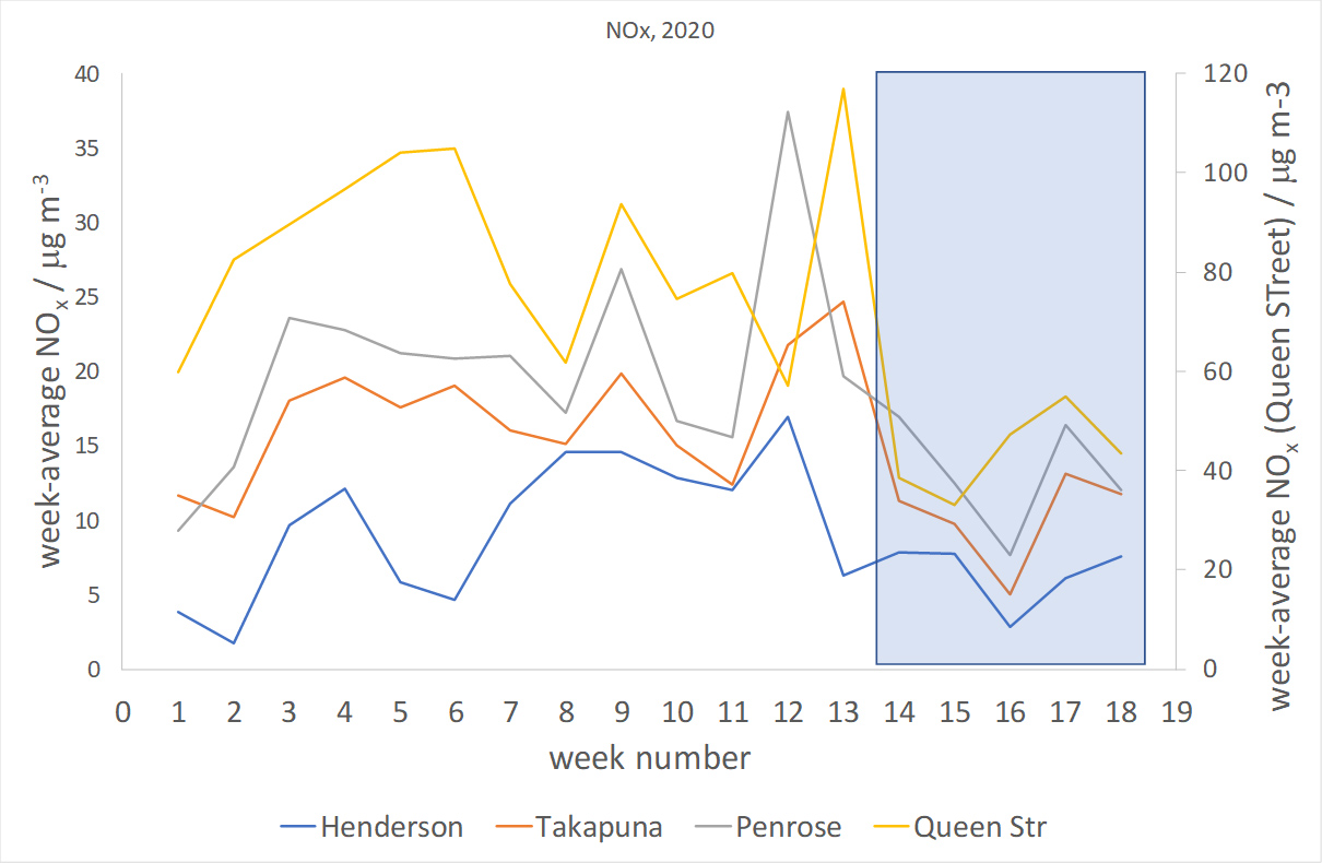
3. Variation in NOx week-by-week
Figure 1 shows the average NOx concentration for each week (Thursday – Wednesday) for 2020 across Auckland. The natural variation in concentrations caused by the weather can clearly be seen. High winds affecting the whole region tend to lead to lower concentrations at all sites, and vice versa. The shaded area shows the level-4 lockdown period covering weeks 14 – 17 and part of week 18. Until week 12 the general trend at all sites was increasing concentrations as is normal for this time of year (caused by gradually weakening dispersion conditions, especially in the morning). Somewhat higher concentrations than normal were observed in weeks 12 or 13 before reducing as full lockdown began. Our analysis has not yet established if this was due to briefly increased traffic or light winds.
4. What about other cities?
This analysis focusses on key monitoring sites in Auckland, Wellington and Christchurch because of the large population they cover and the ready availability of the data. Monitoring of NOx outside of these cities is very limited.
Samples of nitrogen dioxide are measured every month at over 100 locations around the country, with at least one in every major town, on behalf of the NZ Transport Agency. These samples require laboratory analysis and data is usually not available for several months and is conventionally released annually.
Particulate matter is measured in many towns an cities around the country, although the data is not yet available from a single database. A brief analysis of daily average data has not revealed any large reductions (or increases) anywhere in New Zealand during the lockdown period. We hope to analyse this in more detail in the near future.
5. How does air quality in lockdown compare to the past and the future?
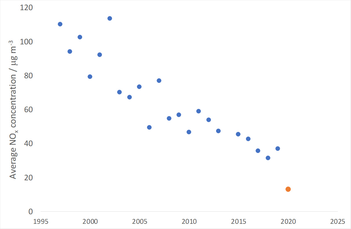
The longest record we have of NOx concentrations is from Penrose in Auckland, where monitoring began in 1997. Figure 2 shows the average NOx concentration between 26th March and 27th April for every year for which monitoring records exist. It can be seen that before lockdown there was a strong and consistent downward trend related to the steady improvement in vehicle technologies. If one assumes that this trend would have continued, or will resume after lockdown is finished, then the concentrations experienced during lockdown will not be repeated until the 2030s. The actual date may depend upon the state of the economy and its effect on traffic volumes, and any accelerated action to transition to electric vehicles, active transport or increase in home working.
6. How do the results compare to cities across the world?
At the moment, valid comparisons are difficult because of the many variations in method that are possible, and lack of international co-ordination.
However, several agencies have published initial analyses particularly for NO2 and PM2.5.
The European Environment Agency has published data showing reduction in NO2 of 24 % in Milan, 26 – 35 % in Rome, 55 % in Barcelona, 41% in Madrid and 51 % in Lisbon. Other sources have reported 9 - 17 % drops in London (28 – 30 % in central London), 24 – 50 % across the UK, 20 – 56 % in Pakistan. These results put New Zealand’s cities (37 – 61 %) at the upper end of air quality improvements reported worldwide.
A review of changes in PM2.5 concentrations around the world during lockdowns found substantial differences around the world. In general, the most polluted cities experienced the largest reduction reductions, such as 50 – 55 % in Delhi, Los Angeles and Wuhan. In contrast, less polluted cities saw little change, or in some cases a small rise in PM2.5, such as a 2% rise in Madrid and a 6% rise in London. Auckland’s normal PM2.5 levels are of a similar magnitude to New York and Madrid, which experienced a fall of 29 % and a rise of 2 % respectively, comparable to the 8 - 10 % reduction observed in Auckland.
Future topics planned for these updates
- Other towns and cities
- Impact of move to level-3 (and hopefully level-2)
- Significance of the changes in air quality for health
- Air quality in our homes.